Logotype creation process
2009-03-06 | ArticlesThis article has the wrong title on purpose. I am going to talk about the creation process of a brand identity, but the companies usually ask for a logotype when they need something more than putting color to a name, therefore...
The secret is in the mass
If you define your logotype as “nice” or “ugly” you really have a problem. Why? Because your company is not “nice” or “ugly". Your company is efficient, competitive and well positioned. If this is not so, you will have more important problems than the design of your logo.
But it is that, besides, your company has PERSONALITY.
The logotype is the most simplified representation of that personality.
Why do we need a briefing for the design of our logo?
It is usually said that "if you fail to plan, you plan to fail".
In the creation of logotypes this assertion results to be, at least, generous. Because the briefing, or it does not exist, or it is so poor that it is not a briefing. That is to say, planning = 0.
The briefing for the creation of a brand consists of a very synthetic summary of the benefits that the product/service of the company contributes with and its commercial strategy.
It comes out to be fundamental that the agency should produce, together with the client, the writing of this small document, agreeing in it all the necessary specifications in order to direct the work correctly
The companies, as the persons, are similar one to the other, but there are not two the same
For example, it is important to know about our advantage and competitive environment previously, because if we share exactly the same values than the rest of the companies of this field we are not complying with the differentiation, and the companies (as the persons), are the same one to the other, but are not two the same.
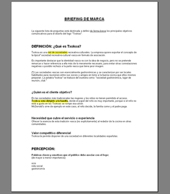
Once at work with the writing, the most frequent problem is the vocabulary. We do not use the adequate words.
Terms as creativity, innovation, confidence, value … have too ambiguous meanings and, what is much worse, they are so worn-out that they have lost all their original brightness.
These definitions only feed the businessmen’s ego, but do not say much to their clients.
The visual tradition
Now that we now the brand and the public, we have to create a logo to link them.
In order to transfer the idea to the paper we have to take into account these three essential criteria: simplicity, originality and the metaphor.
- What is simple is easy to remember
- The originality makes us different from the rest
- The metaphor says more with less
a) The business idea has to be concise. If you do not simplify, the client will do it in his own way.
b) Ask yourself: on which characteristic of our product/service can we focus on in order to build our brand?
c) The metaphor is, essentially, a mnemotechnic association system, an abstract form of communicating the advantages, an archetype.
The metaphor is essential to tell the story that hides behind the brand
A strong metaphor is essentital to tell the story that hides behind the brand.
The ideal is to achieve complicity and emotiveness with it. When the consumers discover the meaning of the small apple of Apple, said necessary connection takes place in order to complete the rest of the message.
Creativity WITH knowledge
We have to define a direction and leave the formal games for the end
The term “creative procedure” is not a dichotomy. We have to work on a well-defined direction, to look for inspiration sources and, this is especially important, to leave the formal games for the end.
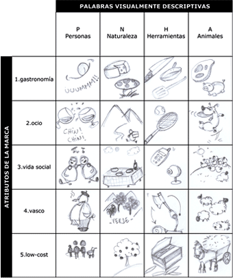
There are a lot of creativity techniques, one are more adequate than others according to the case. For this one, a original of visual metaphors might result useful.
We place the attributes of the brand in an axis and the general terms and visually descriptive in the other one. In this way, we force the creative relations that might when we cross them.
On the color … there is no color: Standardization or originality?
To identify the most extended signs in your sector will help you knowing about the most usual interpretation that will be made from your logo.
The color has shown being a very efficient identification weapon for the brands. On itself, the color stirs up feelings and is easy to recognize. The problem is that everybody knows it and the fight for reaching them is fierce.
The good news is that we are able to delimit the search of the adequate color for the logo focusing in our competitive sector. Afterwards, the game is discussed between the standardization or the breaking-off with it.
Identify the palette of colors and a more extended use of forms within your sector. Thus, you will have a clear view of how are the current existing signs and that will help to the POLITE interpretation of your logo by the public.

Note: the great leaders of the sector are the origin and principal reference of the style lines than then everybody tries to imitate.
BUT TAKE CARE. This visual standardization has a very important defect, and it is that it does not differentiate us, that is one of the main objectives for which the logotypes exist.
Did you do a study about the GRAPHIC IDENTIFICATION OF YOUR COMPETITION before doing yours?
Therefore, look for those elements related to your brand (typography, colors, forms…) that are atypical, or that nobody in your sector had the idea to use it.
Attention, question: Have you done a competition study for your business plan? Yes.
Now: Have you done a study of the graphic identity of your competition before doing yours?
Which name do I put to it?
I have never picked up the phone and heard: "Listen, I am going to create a company and I have thought that you might help me with its design and to seek a name".
In most of the occasions, the order of a logotype comes together with its name. But we should not forget that, if the image is important, the name is important too.
A frequent way of creating a company name is to consider the key attribute and change one or more letters. Or also to join two words, that in many occasions the result turns out to be too forced terms.
Each proper name has to be connected to the brand for a CONCEPTUAL idea, not for a repetition of words
However, it happens something similar to what we have commented previously. It is redundant to try to include the name of the category in the name of the brand. Redundant and generalizer equal to…you know.
Each name has to be autonomous, own and has to be connected to the brand only by a conceptual idea (said metaphor) and not by a repetition of words.
Some technical considerations: flexibility and consistency
Be sure that the logo keeps its personality upright independently from the support. This means that it has to work in white/black and make a careful use of gradients and other complicated techniques.
You should also remember that if you link the slogan to the logotype – or the characteristics of the brand to the name of the company itself – you can complicate your life in the future. Why? The slogans can change more often than the logos and the companies can modify theirs strategic lines according to its evolution or the market´s.
FROM THE THEORY TO THE PRACTICE:
Now that you know the theory, I show you some examples of any creation graphic process of one of our logos.
1. Sketches made with pencil

2. Playing with the colors…
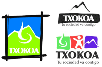
3….and with the types of letter

4. Some more ideas
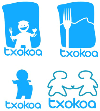
5. And more...

6. And more
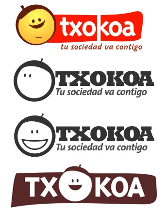
7. We start understanding it…

8. And going into depth in it
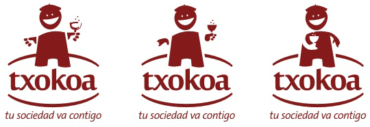
9. Finally, the aesthetic details

10. Closing icons, backgrounds and forms…

11. A few variants to be chosen
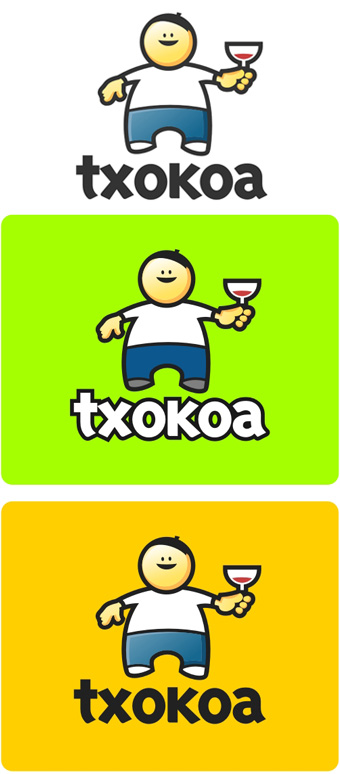
12. The final selection
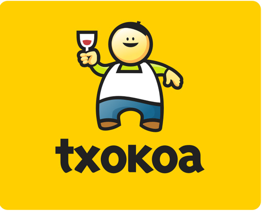
Conclusion
A great logotype does not make a great company; the business does not arise from making a brand. But the brand protects the business and benefits it later, becoming in the active of major value for the great companies. It turns out to be paradoxical, isn´t it true?
The risk is, mainly, uncertainty. The possibilities that we achieve an image that represents adequately our company increase considerably if we follow an ORDERLY work process and with certain logic.
Is this effort worth in order to decide the image that will accompany you during several years?
Which are the plans for your company? Do you see yourself working in it during the future 5 years?
Do you really believe that it is worth so much effort in order to decide the image that will accompany you during so much time?
